Cartoon Network art styles have always been derivative

TheMisterManGuy

Well-Known Member
Joined
Oct 23, 2014
Messages
1,352
Some people complain that Cartoon Network's newer original series all derive from the same CalArts look and feel. It all started with Adventure Time, and since then, most of the channel's in-house shows have a similar feel and aesthetic in one way or another. However, it should be noted that this is nothing new for Cartoon Network. In fact, most Cartoon Network shows have always had a cohesive aesthetic to them. It's just the aesthetics used today are different. But back in the channel's peak through the 90s and early 00s, most of their original shows are derived heavily from the classic Hanna-Barbera style. Go back and watch Dexter's Lab, Powerpuff Girls, Johnny Bravo, Cow & Chicken, I AM Weasel, Samurai Jack, even later shows like Billy and Mandy and Foster's. They all have the look and feel of the old Hanna-Barbera cartoons, hell several of them were produced by Hanna-Barbera during their last few years of existence. The only exceptions to this rule, are series produced by external studios like Courage, Ed Edd n' Eddy, and Codename: Kids Next Door.
 

SaneMan

Well-Known Member
Joined
Nov 13, 2012
Messages
7,216
Location
Slovak Republic
It is pretty stupid to throw Adventure Time into the pile, seeing how there is no show on the network to even look like Adventure Time
 

Robin44

Active Member
Joined
Feb 7, 2017
Messages
308
It is pretty stupid to throw Adventure Time into the pile, seeing how there is no show on the network to even look like Adventure Time
Actually there is, every CN show uses the same style as AT (noodle arms and U shaped teeth) mostly the latter
 

90'sKid

Well-Known Member
Joined
Jul 17, 2015
Messages
1,287
Location
Ohio
Actually there is, every CN show uses the same style as AT (noodle arms and U shaped teeth) mostly the latter

Isn’t U-teeth sorta a general animation trend, as Rick and Morty uses it as well?

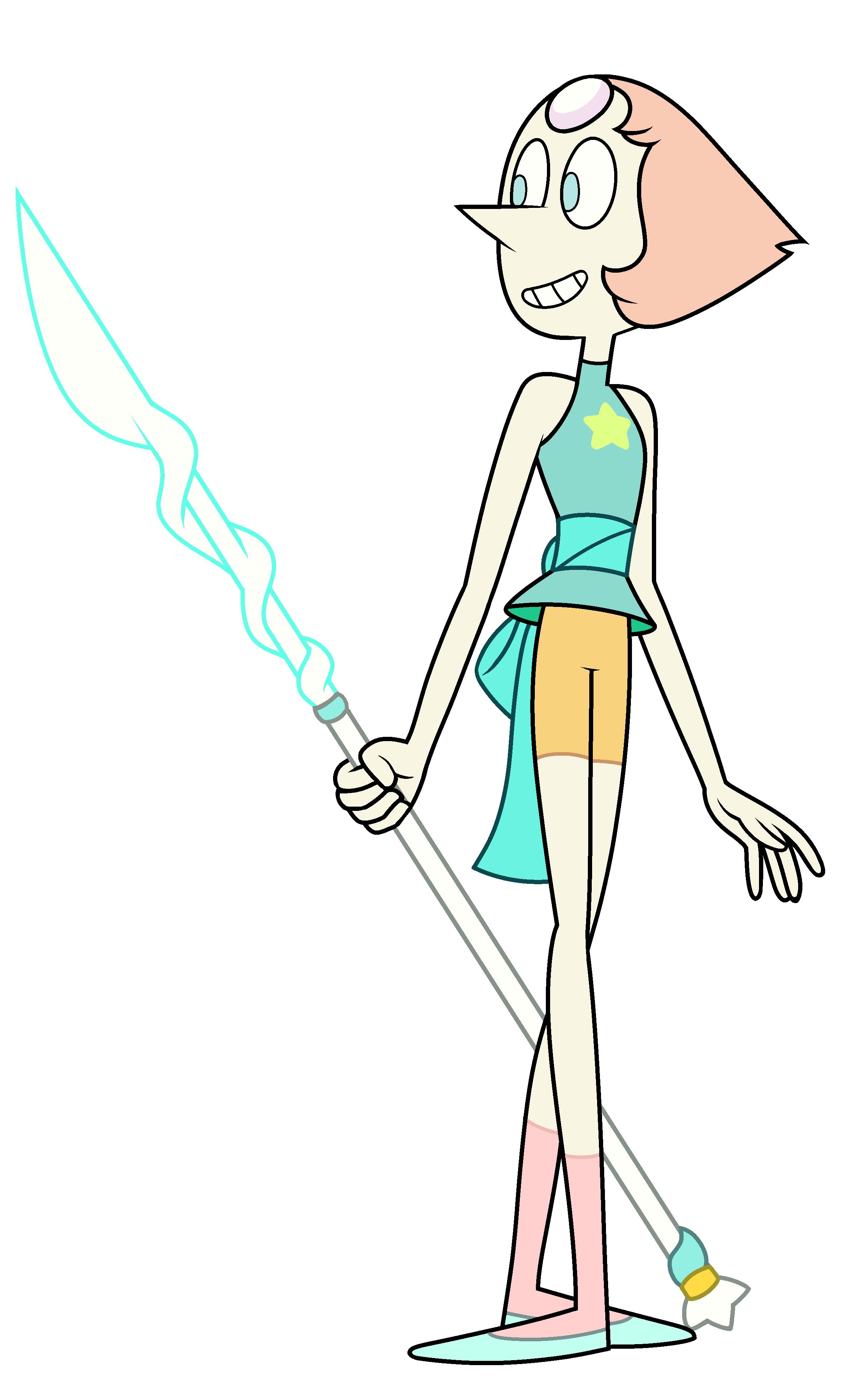
I wouldn’t really say most modern CN shows look like AT, which has a more distinct style (Noodle Limbs and pinpoint eyes) than the current crop of CN shows, which have softer lines, more curvy/bulbous shapes, and large eyes. I would say most follow a more Steven Universe style, than an AT one.

But one must remember that CN tends to prefer a certain style during any one time in its history, the 90’s crop of CN shows leaned towards a very angular and thick-lined animation style, EG Dexters Lab, PPG, Johnny Bravo, Grim Adventures, etc.


Sent from my iPad using Tapatalk
 

Anonymoususer2004

Excelsior!
Joined
Aug 24, 2017
Messages
113
Location
North Carolina
I think the 2000s had the most variety in art styles.
Megas XLR looks nothing like Ben 10 which looks nothing like Camp Lazlo which looks nothing like Samurai Jack. And those are the ones off of the top of my head.
 

Dr.Pepper

Well-Known Member
Joined
Sep 10, 2006
Messages
19,333
Location
In A House
The bears from We Bare Bears look like AT characters. That’s pretty much all I can think of.
 

SaneMan

Well-Known Member
Joined
Nov 13, 2012
Messages
7,216
Location
Slovak Republic
Actually there is, every CN show uses the same style as AT (noodle arms and U shaped teeth) mostly the latter
yeah, cause these two are totally identical
2136_Marceline_AdventureTime_23__11915.1497284120.jpg
Current_Pearl_Request.png
 

Dudley

Moderator
Staff member
Moderator
Joined
Aug 10, 2003
Messages
29,192
Location
East Coast of USA
All cartoon art styles have been derivative. It’s because when one show becomes a hit, network executives want other shows pitched to them to look similar (and at times, be similar in tone). If it looks like the most popular show, kids will more drawn to it.

This has been going on since animation began. Just a few years ago, we had the thick outline Butch Hartman style be a thing, and people seem to have forgotten when everything tried to look like an anime.

People need to seriously get over themselves and accept that art evolves over time. And they should stop blaming artists when it’s the network / studio executives fault.


Sent from my iPhone using Tapatalk
 

Zanneck

HAIL NEO ARCADIA. NEO ARCADIA FOREVER.
Joined
Sep 26, 2011
Messages
12,048
Location
Neo Arcadia, USA
All cartoon art styles have been derivative. It’s because when one show becomes a hit, network executives want other shows pitched to them to look similar (and at times, be similar in tone). If it looks like the most popular show, kids will more drawn to it.

This has been going on since animation began. Just a few years ago, we had the thick outline Butch Hartman style be a thing, and people seem to have forgotten when everything tried to look like an anime.

People need to seriously get over themselves and accept that art evolves over time. And they should stop blaming artists when it’s the network / studio executives fault.


Sent from my iPhone using Tapatalk

Thank you.

yeah, cause these two are totally identical
2136_Marceline_AdventureTime_23__11915.1497284120.jpg
Current_Pearl_Request.png

You, too - thank you.

Seriously, don't blame the artists; blame the networks for not taking enough risks on differing artstyles.
 

Spotlight

Who's on Discord?

Latest profile posts

Looking at the Boomerang Imaginary Rebrand pitch really makes me wish that we get this rebrand instead of what we got in 2015.

I was at my local Wal-Mart, and they had merchandise out for the new Garfield movie. There's a plush doll of Baby Garfield that meows, and you have to feed him a piece of lasagna or pizza.
I want to thank both Silverstar and Goldstar for their awesome posts and great presence in this forum. Love ya!
Hey, internet: You all owe Natasha Klein (creator of Primos) an apology. It doesn't matter if you want to watch the show or not. There was no logical reason to unleash that level of vitriol over just a few words, especially before the show has even aired. Now all of y'all line up and tell her you're sorry.

Featured Posts

Top